My Favorite Basics
Updated from a previous post...
I was once asked about the brand of paint I use and whether I prefer cold water or hot water to paint. Both were interesting questions and I didn't have an immediate answer for that customer - though I should have!
After that, I have made an effort to become more aware of the supplies I use to create my artwork, and why I prefer some brands over others. This has been a good exercise for me as well as arming me with the sure knowledge of the answers to those questions should they arise again sometime in the future!
 |
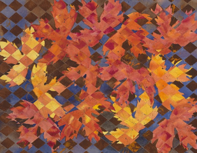
| "A Patchwork Fall" - watercolor ©Jennifer Love |
I once ran out of Ultramarine Blue paint in my palette and had to replace it with a tube from a brand I don't normally use. While the color match was similar, the properties of the paint differed quite a bit in use. It helped me realize why I seek out my preferred brand of paint. :)
As to the cold vs. hot water, I generally use cold tap water. Over time it becomes room temperature, until I dump the basin out and start with fresh water. I haven't really experimented with hot to see if that makes a difference in dissolving the paint or how the paint goes onto the paper, but for my purposes, I don't think the temperature of the water makes as much difference as the dilution level I am trying to achieve with the paint.
As to the cold vs. hot water, I generally use cold tap water. Over time it becomes room temperature, until I dump the basin out and start with fresh water. I haven't really experimented with hot to see if that makes a difference in dissolving the paint or how the paint goes onto the paper, but for my purposes, I don't think the temperature of the water makes as much difference as the dilution level I am trying to achieve with the paint.
 |
| "Peaceful Daisies" - watercolor ©Jennifer Love |
It's important to note that every artist has their own preferences, and there is no "right" or "wrong" answer to the choice of paint and supplies. We have all used various brands and quality of paint, and decided what we like the best. And maybe some don't have a preference.
But, for those who are interested, here are my supplies and materials preferences.
I love M. Graham watercolor paint. These are professional grade paints and are archival. These paints are little bit hard to find these days in a craft store or art supply store, but I tend to order mine online - usually through Blick Art Supplies (the company that recently purchased Utrecht).
M. Graham makes their paint in small batches using pure gum arabic and natural blackberry honey. These paints don't dry up in the tube - even those I've had in my box for years! They also re-wet very easily on the palette and I usually don't experience the "grainy" consistency that comes with rewetting some colors in other brands I have tried. The colors are brilliant, they dry nicely, and are represented well both wet and dry.
But, for those who are interested, here are my supplies and materials preferences.
I love M. Graham watercolor paint. These are professional grade paints and are archival. These paints are little bit hard to find these days in a craft store or art supply store, but I tend to order mine online - usually through Blick Art Supplies (the company that recently purchased Utrecht).
 |
| Image source: public domain. Copyright belongs to respective photographer, company, or graphic designer. |
M. Graham makes their paint in small batches using pure gum arabic and natural blackberry honey. These paints don't dry up in the tube - even those I've had in my box for years! They also re-wet very easily on the palette and I usually don't experience the "grainy" consistency that comes with rewetting some colors in other brands I have tried. The colors are brilliant, they dry nicely, and are represented well both wet and dry.
 |
| "Flutter" - watercolor ©Jennifer Love |
For watercolor paper, I prefer Arches 140 lb Cold Press, or sometimes 300 lb Cold Press. Again, these are professional-grade, archival papers. There is a smooth side and a rough side, but I prefer to use the rough side to add more texture to my painting.
Here is the description of Arches' paper-making process on the Blick website.
"Arches watercolor papers are mouldmade in France, with 100% cotton fiber content. They are acid-free, pH-neutral, gelatin-sized, and air dried. Sheets have two natural deckle edges, two torn deckle edges, and are watermarked and embossed."
So, if you happen to see embossing or a watermark on one of your watercolor paintings that says "Arches," know that it is not a bad thing! You actually have a painting that is created on high-quality paper and happened to get the watermark to prove it!
 |
| "Kokopelli Weave" - watercolor ©Jennifer Love |
I do still use other brands of paper from time to time, and will use up whatever art supplies I have been given or purchased to try (waste not, want not!). But, when it comes to making a painting I want to enter into a competition or hope to sell in a gallery setting, it is almost always on Arches!
When it comes to brushes, I have a variety - from inexpensive craft store brushes, to high-end sable. However, I have found that I am pretty rough on my brushes and they wear out - and the expensive ones don't seem to last much longer that the cheaper brushes. So, I have ultimately found that I like Blick (formerly Utrecht) store brand brushes. They are affordable, durable, and form a nice point for quite a long time before they wear out on me. I love my Round #20, #18, #10 and #8 brushes. Even though I have a huge variety of other sizes and shapes, I rarely venture beyond these four. They tend to serve my needs very well. I don't use flat brushes all that much - occasionally for washes or wetting down my paper - so, I am less picky about the brand of flat brush. But, I really like the Blick store brand in general. Some watercolorists I know really like hake brushes for wetting paper down and for soft edges, but I haven't found much use for them yet in my work.
When it comes to brushes, I have a variety - from inexpensive craft store brushes, to high-end sable. However, I have found that I am pretty rough on my brushes and they wear out - and the expensive ones don't seem to last much longer that the cheaper brushes. So, I have ultimately found that I like Blick (formerly Utrecht) store brand brushes. They are affordable, durable, and form a nice point for quite a long time before they wear out on me. I love my Round #20, #18, #10 and #8 brushes. Even though I have a huge variety of other sizes and shapes, I rarely venture beyond these four. They tend to serve my needs very well. I don't use flat brushes all that much - occasionally for washes or wetting down my paper - so, I am less picky about the brand of flat brush. But, I really like the Blick store brand in general. Some watercolorists I know really like hake brushes for wetting paper down and for soft edges, but I haven't found much use for them yet in my work.
 |
| My brushes |
 |
| My brushes |
And, finally, the palette. Some artists like to make their own palette (to save money or to customize the wells). Others (like me) buy their palette. I am into whatever is most useful to me, easy, and convenient - so I have more time to paint! I like the Robert E. Wood palette. It comes with a lid, which is nice. I tuck the lid underneath the palette when I am using it, raising the palette up slightly like a pedestal. (Somehow, I just find it easier to paint like that!) There are several wells to organize your paint, and two large sections for mixing. Plus, you can use the lid for extra mixing space or paint color as needed. It is also reasonably priced at less than $15. I actually have two of these, but only one in use at any given time. :)
My palette is organized with similar colors grouped together. I try to have a warm and a cool of each primary color, and generally mix my secondaries, though not always. The colors I use most often are Ultramarine Blue, Cadmium Orange, Cadmium Red Light, Cadmium Yellow, Hansa Yellow, Cobalt Teal (special color), and Quinacridone Rose (special color). Also, rather than pure black, I prefer Sepia for my "black" when needed; and I rarely use pure white, though I have some if needed. There are other colors on my palette, of course, but those are the colors I use the most.
So, there you have it! My favorite basics. What are your favorites?
As always, thanks for stopping by my blog! :)
My palette is organized with similar colors grouped together. I try to have a warm and a cool of each primary color, and generally mix my secondaries, though not always. The colors I use most often are Ultramarine Blue, Cadmium Orange, Cadmium Red Light, Cadmium Yellow, Hansa Yellow, Cobalt Teal (special color), and Quinacridone Rose (special color). Also, rather than pure black, I prefer Sepia for my "black" when needed; and I rarely use pure white, though I have some if needed. There are other colors on my palette, of course, but those are the colors I use the most.
 |
| See the lid tucked nicely underneath? |
 |
| Extra little wells in the lid if you need more mixing space or need to put other paint colors on. |
So, there you have it! My favorite basics. What are your favorites?
As always, thanks for stopping by my blog! :)


Comments
Post a Comment